WJie12

Blog from Jie Wang


  • 首页

  • 关于

  • 归档

  • 分类

NAR Database update 2020

发表于 2020-07-25 | 分类于 other

DNAproDB

DNA–protein complex structure analysis
Paper
Document

  • Update
    • Structure processing upgrades
    • Data update
    • Database and web interface
      • Search
      • Report
      • Integration with Nucleic Acid Database
  • Discussion and conclusion
    • case study

EnhancerAtlas

Enhancers in nine species
Paper
Document

  • Materals and methods
    • Data sources
    • Data processing for individual dataset/track
    • Generation of consensus track
    • Enhancer-gene interactions
    • Implenentation of database
  • Results
    • statistics
    • Database search
    • Enhancer browser

GWAS Central

GWAS datasets
Paper
Document

  • Materials and methods
    • Data collection and curation
    • Ontology mapping
    • Database design
  • Results
    • GWAS data searching
    • Data visualization
  • Discussion

MatrisomeDB

Extracellular matrix components
Paper
Document

  • Database infrastructure
    • Data sets included
    • Mass spectrometry data search and processing
  • Database features and functionalities
    • MatrisomeDB query
    • Hierarchically-clustered protein distribution heatmap
    • Peptide converage map
  • Results
    • Experimental coverage of the in-silico predicted matrisome
    • Building an ECM atlas
  • Future directions
    • Future data extension
    • Extension to include studies from other model organisms
    • Extracting quantitative data from label-free and label-based proteomics studies

MIBiG

Biosynthetic Gene Clusters of Known Function
Paper
Document: No

  • Methods and implementation
    • Manual curation of entries
    • Data quality improvements
    • The new database architecture
  • Results and discussion
    • Data overview
      • BGC diversity
      • Annotation completeness
    • A new online repository

MirGeneDB

Animal miRNA complements
Paper
Document

  • Expansion of MirGeneDB
  • Quality of MirGeneDB annotations
  • Improved web interface of MirGeneDB
  • MiRNA nomenclature
  • Functional classfication of MiRNA-seeds
  • Future developments

MSDB

Microsatellites from all sequenced genomes
Paper
Document

  • Materials and methods
    • Data sources
    • Identification of repeats
    • Database design
    • Web interface
  • Database overview and functionality
    • Dashbord view
    • Species selection
    • Modal view
    • Tabel view
    • Data download
    • Help page
  • Discussion
    • Case study 1: length preference of AGAT repeats
    • Case study 2: enrichment of AGC repeats in ruminants

Ohnologs

Vertebrate ohnologs
Paper
Document

  • Results
    • Data collection and processing
    • Navigating teh OHNOLOGS database
    • Summary of the contents of the OHNOLOGS database

PolyASite

RNA polyadenylation sites
Paper
Document

  • Materials and methods
    • Protocal-spefici pre-processing of reads
    • Uniform analysis of putative poly(A) sites in individual samples
    • Clustering of closely spaced sites
    • Annotation and quantification of pply(A) sites
  • Results
    • Website roadmap

WALTZ-DB

Amyloidogenic peptide sequences
Paper
Document

  • Expanded content and feature improvements
    • New peptide entries and database statistics
    • WALTZ-DB 2.0 novel features
  • Materials and methods
    • Peptide synthesis
    • Determination of amyloid fibril properties
    • Structural models and energy calculations
  • Links to other databases
ConvexOptimization_Introduction

发表于 2020-03-09 | 分类于 ConvexOptimization

Optimization problem

Three basic elements

  • variables:$\boldsymbol{x}=\left(x{1}, \dots, x{n}\right)$
  • constraints: $f_{i}: \mathbb{R}^{n} \rightarrow \mathbb{R}, i = 1,…,m$
  • objective: $f_{0}: \mathbb{R}^{n} \rightarrow \mathbb{R}$

    Goal

    Find optimal solution $\boldsymbol{x}^{*}$ minimizing $f_{0}$ while satifying constraints.

Data science models

Linear

  • minimize $f(\boldsymbol{x})$ subject to $\boldsymbol{Ax=z}$
  • hope $\hat{\boldsymbol{x}}=\boldsymbol{x}^{\natural}$

    Bilinear

  • find $\boldsymbol{x}, \boldsymbol{h}$ subject to $z{i}=\boldsymbol{b}{i}^{} \boldsymbol{h} \boldsymbol{x}^{} \boldsymbol{a}_{i}, 1 \leq i \leq m$

    Quadratic

  • find $z \quad$ subject to $y{r}=\left|\left\langle\boldsymbol{a}{r}, \boldsymbol{z}\right\rangle\right|^{2}, \quad r=1,2, \ldots, m$

    low -rank

  • $\underset{M \in \mathbb{C}^{m \times n}}{\operatorname{minimize}} \quad \operatorname{rank}(\boldsymbol{M}) \quad$ subject to $\quad Y{i, k}=M{i, k}, \quad(i, k) \in \Omega$

    deep models

  • $\operatorname{minimize} \quad f(\boldsymbol{\theta}):=\frac{1}{n} \sum{i=1}^{n} \ell\left(h\left(\boldsymbol{x}{i}, \boldsymbol{\theta}\right), y_{i}\right)$ subject to $\mathcal{R}(\boldsymbol{\theta}) \leq \tau$

Large-scale optimization: classes of optimization problems

Constrained vs. unconstrained

  • Unconstrained optimization:
    • every point is feasible
    • focus is on minimizing $f(\boldsymbol{x})$
  • constrained:
    • find constraint set $C$
    • minimizing $f(\boldsymbol{x}), \boldsymbol{x} \in C$
    • may be difficult to find point $\boldsymbol{x} \in C$

      Convex vs. nonconvex

  • convex optimization:
    • all local optima are global optima
    • can be solved in polynomial-time

      deteministic vs. stochastic

  • stochastic gradient

    solvability vs. saclability

  • Polynomial-time algorithms might be useless in large-scale applications (iteration -)
    • example: Newton’s method
    • a single iteration may last forever (time +)
    • prohibitive storage requirement (space +)
  • Iteration complexity vs. per-iteration cost
    • computational cost = iteration complexity (#iterations) $\times$ cost per iteration
  • Large-scale problems call for methods with ==cheap iterations==
    • First-order methods: exploit only information on function values and (sub)gradients without Hessian information
      • cheap iterations
      • low memory requirements
    • Randomized and approximation methods: project data into subspace, and ==solve reduced dimension problem==
      • optimization for high-dimensional data analysis: polynomial-time algorithms often not fast enough: ==further approximations== are essential
    • Adavanced large-scale optimization
      • randomized methods; nonconvex optimization on manifold; learning to optimize; deep reinforcement learning
      • goal: scalable, real-time, parallel, distributed, automatic, etc.

High-dimensional statistics

Convex geometry

Local geometry

Global geometry

Topics and grading

Theoretical foundations

convex sets, convex functions, convex problems, lagrange duality and KKT conditions, disciplined convex programming

first-order methods

gradient methods, subgradient methods, proximal methods

second-order methods

Newton methods, interior-point methods, quasi-Newton methods

stochastic methods

stochastic gradient methods, stochastic Newton methods, randomized sketching methods, randomized linear algebra

machine learning approaches

applications

Deep Reinforcement Learning in Portfolio Management

发表于 2020-01-19 | 分类于 Other

Deep Generative Model for Auto-annotation in Single-cell Analysis

发表于 2020-01-19 | 分类于 Bioinformatics


Notes for small RNA sequencing analysis

发表于 2019-12-08 | 分类于 Bioinformatics

Introduction

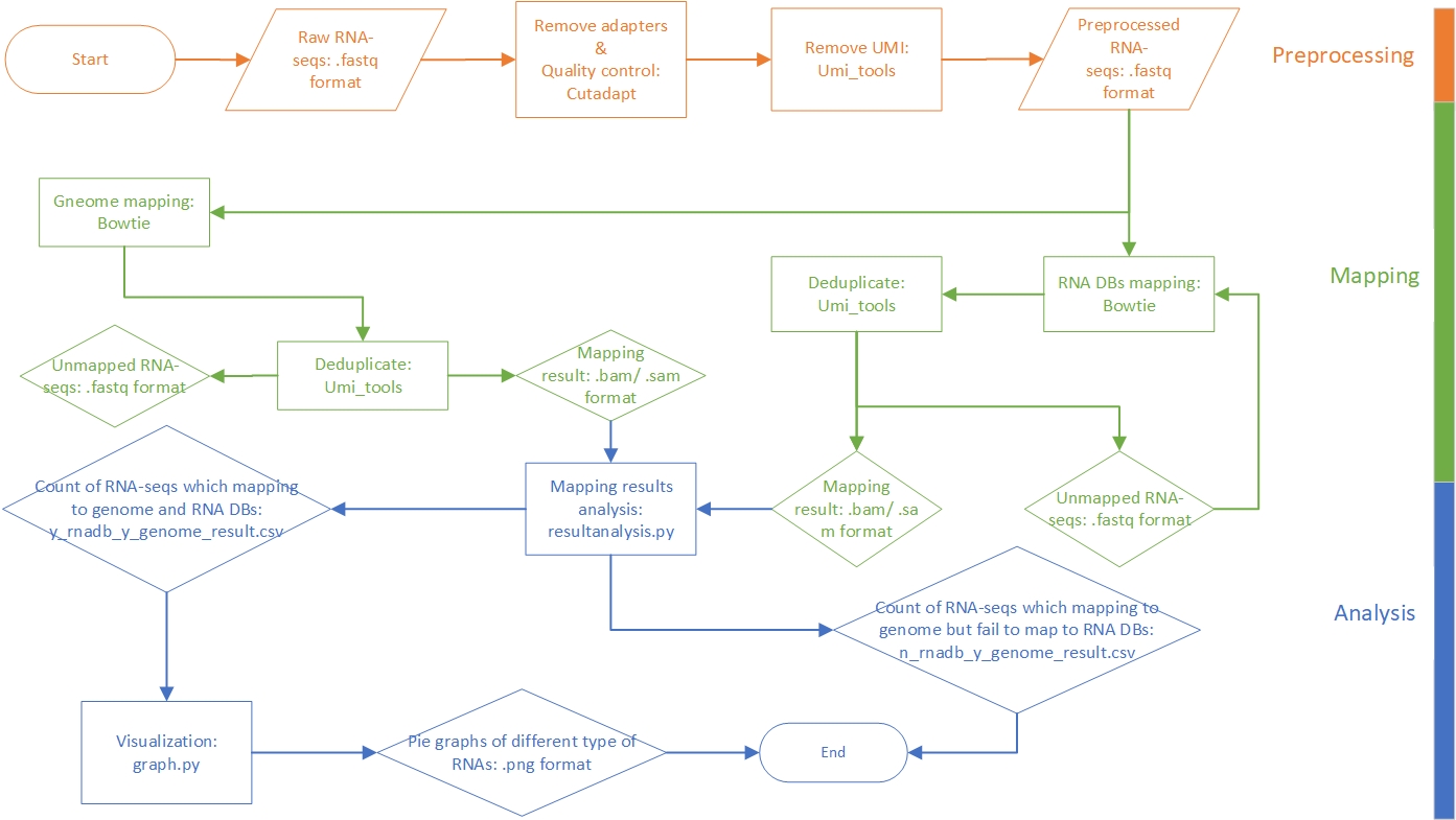
This pipeline is developed for annotating and profiling small RNAs with UMI attached to both ends. The raw data are reads in FASTQ format. After preprocessing and mapping to reference libraries, we can statistic the reads. Particularly, the reads which can be aligned to the genome but cannot be aligned to RNA sequences databases will be filtered out and written to a CSV format file. The following figure presents a general workflow of the pipeline.

workflow

Methods

Preprocessing

The preprocessing phase includes three parts: adapter extraction, quality control, UMI extraction. At first, adapters in 3’ end and 5’ end are removed by Cutadapt and then only reads whose length within 27~55nt are retained. Finally, UMIs in both 3’ end and 5’ end are extracted from sequence reads and add to read names with UMI-tools. At the UMI extraction step, reads with poor quality are dropped at the same time by UMI-tools.

Software and parameters used in this phase:

Software Parameter Effect
Cutadapt -j 40 use 40 CPU cores
-a AGATCGGAAGAGCACACGTC remove 3’ end adapter: AGATCGGAAGAGCACACGTC
-g GTTCAGAGTTCTACAGTCCGACGATC remove 5’ end adapter: GTTCAGAGTTCTACAGTCCGACGATC
—overlap=3 require at least three bases match between adapter and read
—error-rate=0.1 the level of error tolerance (mismatch) in adapter sequences searching
—times=1 trim no more than one adapter from each reads
—minimum-length=27 —maximum-length=55 drop reads shorter than 27nt or longer than 55 nt
UMI-tools extract —bc-pattern=NNNNNNNNN —3prime extract 9nt as UMI from 3’ end
—bc-pattern=NNNNNN extract 6nt as UMI from 5’ end
—quality-filter-threshold 20 filter low quality reads

Mapping

The preprocessed reads are still in FASTQ format. The reads are aligned to genome and RNA databases with Bowtie, respectively. The following table lists the reference libraries we use in alignment. After aligning to references, the duplicate reads (reads with the same alignment position and UMI) will be dropped by umi_tools. After mapping, we can get the annotated reads in SAM format.

Genome RNA databases(sort by mapping order)
hg19 mature tRNA
tRNA
rRNA
miRNA
piRNA
Rfam

Software and parameters used in this phase:

Software Parameter Effect
Bowtie -q input format: FASTQ
—threads 40 run in 40 threads
-v 1 allow 1 mismatch
-m 1 each reads can only be aligned once
-a keep all mapping results
-un write all reads that could not be aligned to a file
UMI-tools dedup —method=unique do not consider the sequencing mistakes in UMIs
—read-length duplicate reads must have the same length

Analysis

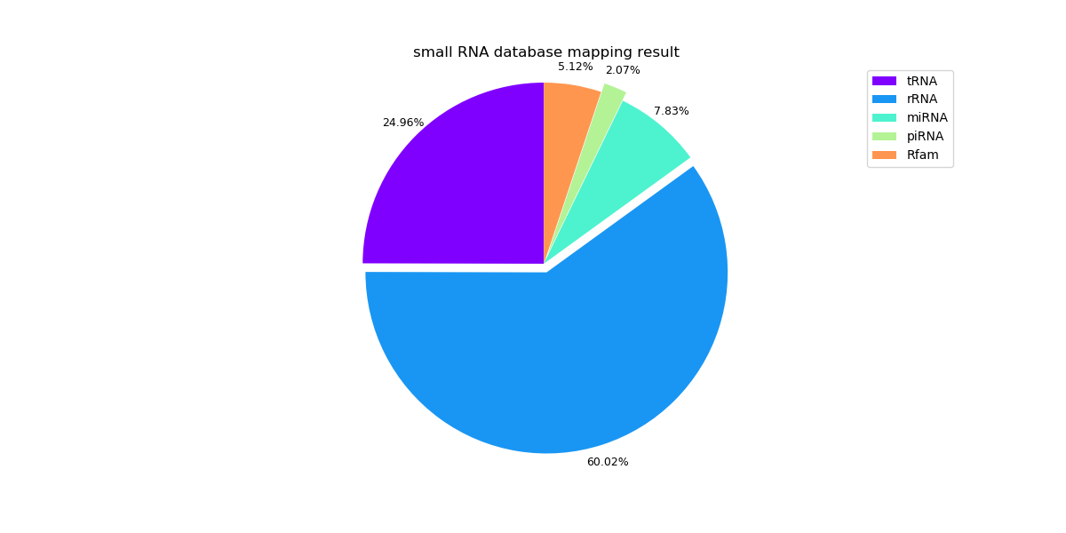
With the SAM format files in the mapping phase, we can count the reads. The reads with the same annotation will be counted as the same RNA. Pie graphs to visualize the percentage of different types of RNAs are plotted based on the counts. Besides counting the reads that mapping to the RNA databases, we can also filter the sequences that can be aligned to the genome but not to RNA databases. The statistics results are saved in y_rnadb_y_genome.csv and n_rnadb_y_genome.csv. The statistic and visualization are conducted with Python scripts.

Implement

The preprocessing phase and mapping phase are implemented by Shell scripts, and the analysis phase is implemented by Python scripts. The source code and more details of these scripts can be found in SmallRNASeq.

Full analysis results of samples can be found in the attachment.

Results

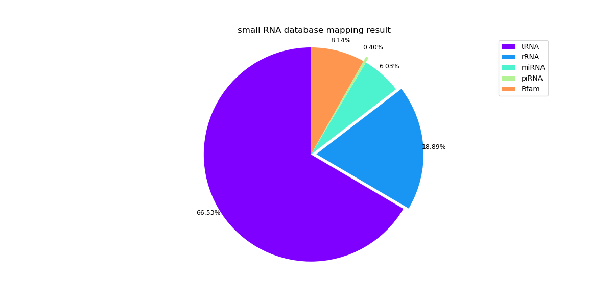
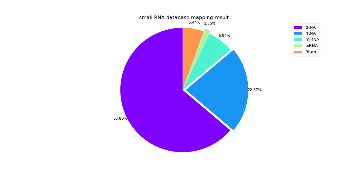
The following pie graphs show the mapping results of different samples.

Sample 1:

s1_y_rnadb_y_genome_result

Sample 3:

s3_y_rnadb_y_genome_result

Sample 5:

s5_y_rnadb_y_genome_result

The head of the n_rnadb_y_genome.csv for sample 1:

n_rnadb_y_genome

Monocle拟时分析

发表于 2019-11-13 | 分类于 Bioinformatics
  1. 读入数据

    基于上一篇Seurat的分群的结果进行处理,已经进行过预处理降维分群。

    导入上篇保存的pbmc数据

    1
    > load('./output/res0.5.Robj')

    取其中两个亚群进行分析

    1
    2
    3
    > sub_pbmc <- subset(pbmc, idents=c(3,4))
    # 目前数据是个seurat对象
    > seurat_object <- sub_pbmc

    每个群取10个marker基因,为下面monocle分析准备

    1
    2
    > markers <- FindAllMarkers(sub_pbmc, only.pos = TRUE, min.pct = 0.25, logfc.threshold = 0.25)
    > top10 <- markers %>% group_by(cluster) %>% top_n(n = 10, wt = avg_logFC)

    接下来从seurat object中提取创建monocle对象需要的数据

    提取表达矩阵,转化为matrix类型

    1
    > data <- as(as.matrix(seurat_object@assays$RNA@data), 'sparseMatrix')

    提取细胞表,并转化成AnnotatedDataFrame类型

    1
    > pd <- new('AnnotatedDataFrame', data = seurat_object@meta.data)

    提取基因注释,并转化成AnnotatedDataFrame类型

    1
    2
    > fData <- data.frame(gene_short_name = row.names(data), row.names = row.names(data))
    > fd <- new('AnnotatedDataFrame', data = fData)
  2. 创建monocle对象

    newCellDataSet需要输入一个表达矩阵,AnnotatedDataFrame格式的行坐标(sample name)和纵坐标(gene name)

    1
    2
    3
    4
    5
    6
    #Construct monocle cds
    > cds <- newCellDataSet(data,
    phenoData = pd,
    featureData = fd,
    lowerDetectionLimit = 0.5,
    expressionFamily = negbinomial.size());
  3. 预估size factors和分散

    1
    2
    > cds <- estimateSizeFactors(cds)
    > cds <- estimateDispersions(cds)
  4. 提取表达基因

    1
    expressed_genes <- row.names(subset(fData(cds)))
  5. 建立轨迹

    采用之前每个群选取的10个marker(top10)来建立轨迹

    将top10读取成矩阵

    1
    2
    > ordering_genes<-as.matrix(top10)
    ime.txt")

    过滤

    1
    > cds <- setOrderingFilter(cds, ordering_genes = ordering_genes)

    降维

    1
    > cds <- reduceDimension(cds, max_components = 2, method = 'DDRTree',auto_param_selection = F) # take long time

    排序

    1
    > cds <- orderCells(cds)

    保存

    1
    2
    > save(cds,file="./output/orderCells.Robj")
    write.table(pData(cds),file="./output/my_pseudotime.txt")

    查看

    1
    2
    3
    4
    5
    6
    7
    8
    9
    10
    11
    12
    13
    14
    15
    > head(pData(cds))
    orig.ident nCount_RNA nFeature_RNA percent.mt RNA_snn_res.0.5 seurat_clusters S.Score G2M.Score
    AAACATACAACCAC pbmc3k 2419 779 3.017776 4 4 0.06500339 -0.065012414
    AAACATTGAGCTAC pbmc3k 4903 1352 3.793596 3 3 -0.01906540 -0.132349057
    AAACCGTGTATGCG pbmc3k 980 521 1.224490 4 4 -0.01086219 0.005361576
    AAACGCTGACCAGT pbmc3k 2175 782 3.816092 4 4 -0.03122878 -0.053972321
    AAACGCTGGTTCTT pbmc3k 2260 790 3.097345 4 4 -0.03190767 -0.011423063
    AAACTTGAAAAACG pbmc3k 3914 1112 2.631579 3 3 0.04395791 -0.080502879
    Phase Size_Factor Pseudotime State
    AAACATACAACCAC S 1.3046257 4.343051 6
    AAACATTGAGCTAC G1 2.6443075 6.530045 8
    AAACCGTGTATGCG G2M 0.5285379 0.000000 1
    AAACGCTGACCAGT G1 1.1730306 3.882721 5
    AAACGCTGGTTCTT G1 1.2188731 1.263559 1
    AAACTTGAAAAACG S 2.1109157 6.543204 8
  6. 画轨迹图

    1
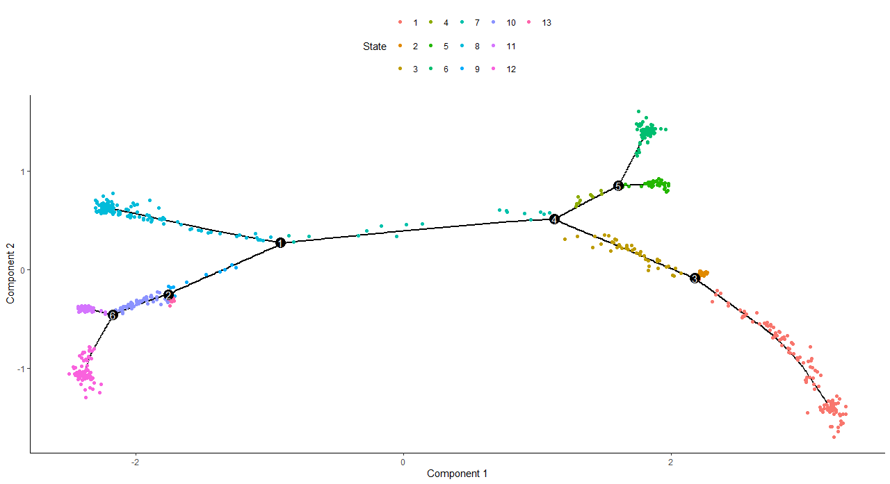
    > plot_cell_trajectory(cds, color_by = "State")

    trajectory_state

    1
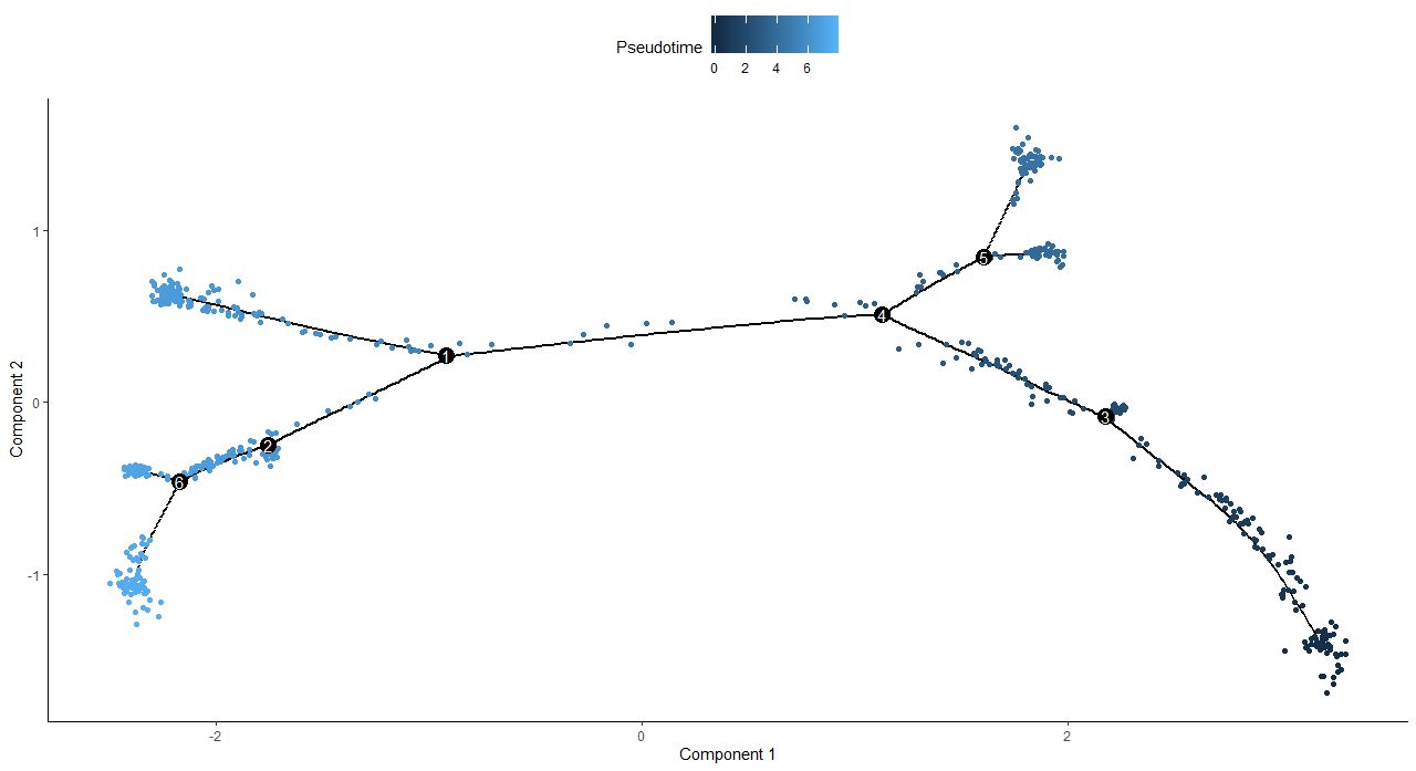
    > plot_cell_trajectory(cds, color_by = "Pseudotime")

    trajectory_psudotime

    1
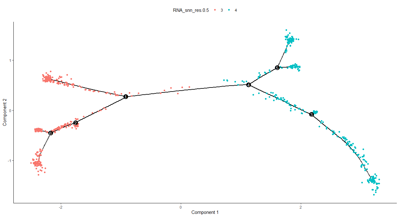
    > plot_cell_trajectory(cds, color_by = "RNA_snn_res.0.5")

    trajectory_snn_res.0.5

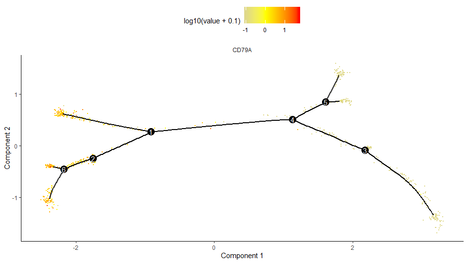
    特定基因在在轨迹上的表达量图

    1
    > plot_cell_trajectory(cds, markers="CD79A", cell_size=0.5, use_color_gradient=T) + scale_color_gradient2(low="gray",mid="yellow",high="red")

    trajectory_gene

  7. 展示感兴趣的基因热图(一个方向变化)

    1
    2
    3
    4
    5
    > my_pseudotime_de <- differentialGeneTest(cds,fullModelFormulaStr = "~sm.ns(Pseudotime)",cores = 5)

    > sig_gene_names <- row.names(subset(my_pseudotime_de, qval < 10^-20))

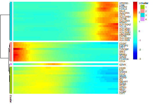
    > plot_pseudotime_heatmap(cds[sig_gene_names,], num_clusters = 4,cores = 5,use_gene_short_name = TRUE,show_rownames = TRUE)

    pseudotime_heatmap

  8. 展示感兴趣基因基因拟时间表达变化(一个方向

    1
    2
    3
    4
    5
    6
    7
    8
    9
    10
    > c<-subset(my_pseudotime_de, qval < 10^-20)

    > to_be_tested <- row.names(subset(fData(cds),gene_short_name %in% c("CD79A", "NKG7", "HLA-DRA", "CCL5")))
    > cds_subset <- cds[to_be_tested,]

    > diff_test_res <- differentialGeneTest(cds_subset,fullModelFormulaStr = "~sm.ns(Pseudotime)")

    > diff_test_res[,c("gene_short_name", "pval", "qval")]

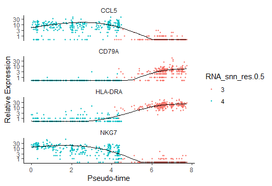
    > plot_genes_in_pseudotime(cds_subset,color_by="RNA_snn_res.0.5")

    Rplot_gene_pseudotime

  9. 两个方向的图

    热图

    1
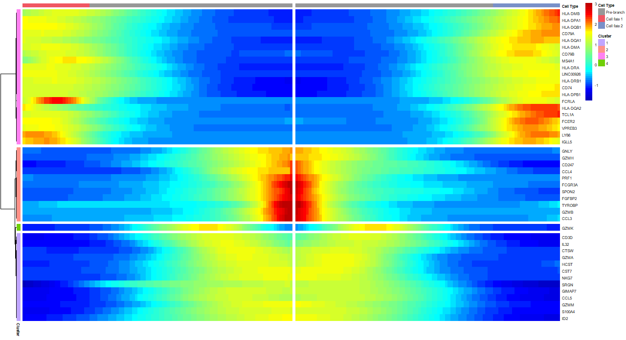
    > plot_genes_branched_heatmap(cds[sig_gene_names,], num_clusters = 4,cores = 5,use_gene_short_name = TRUE,show_rownames = TRUE)

    heatmap_2dir

    拟时间表达

    1
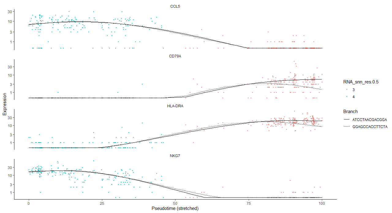
    > plot_genes_branched_pseudotime(cds_subset, branch_point = 2,color_by="RNA_snn_res.0.5")

    branched_pseudotime_2dir

Seurat单细胞分群

发表于 2019-11-13 | 分类于 Bioinformatics
  1. 前言

    数据:10X官方提供的PBMC数据集,2700个外周血单核细胞(PBMC,Peripheral Blood Mononuclear Cells)公共数据,使用Illumina NextSeq 500测序。

    原始教程和代码:Seurat - Guided Clustering Tutorial

    1
    2
    3
    4
    hg19
    |__barcodes.tsv
    |__genes.tsv
    |__matrix.mtx
  2. 数据读取

    读入pbmc数据。

    1
    > pbmc.data <- Read10X(data.dir = "./data/pbmc3k_filtered_gene_bc_matrices/filtered_gene_bc_matrices/hg19/")

    查看稀疏矩阵的维度,即基因数和细胞数。

    1
    2
    > dim(pbmc.data)
    [1] 32738 2700

    查看矩阵的1-5行,1-3列。

    “ · ”表示没有检测到,也就是0。这样表示是为了压缩空间。

    1
    2
    3
    4
    5
    6
    7
    8
    > pbmc.data[1:5,1:3]
    5 x 3 sparse Matrix of class "dgCMatrix"
    AAACATACAACCAC AAACATTGAGCTAC AAACATTGATCAGC
    MIR1302-10 . . .
    FAM138A . . .
    OR4F5 . . .
    RP11-34P13.7 . . .
    RP11-34P13.8 . . .
  3. 预处理:质控和数据筛选

    创建Seurat对象

    project是对象的名字,可以用来标识不同的样本

    min.cell: 单个基因在小于等于3个细胞中测到就丢弃

    min.features: 单个细胞测到小于等于200个基因说明可能是死细胞也丢弃

    1
    2
    3
    4
    > pbmc <- CreateSeuratObject(counts = pbmc.data, project = "pbmc3k", min.cells = 3, min.features = 200)
    An object of class Seurat
    13714 features across 2700 samples within 1 assay
    Active assay: RNA (13714 features)

    计算每个细胞的线粒体基因转录本数的百分比(%)

    使用[[ ]] 操作符存放到metadata中

    线粒体很多说明细胞可能是死细胞或者活性太低

    1
    > pbmc[["percent.mt"]] <- PercentageFeatureSet(pbmc, pattern = "^MT-")

    检查一下metadata

    查看metadata前三行

    1
    2
    3
    4
    5
    > head(pbmc@meta.data, 3)
    orig.ident nCount_RNA nFeature_RNA percent.mt
    AAACATACAACCAC pbmc3k 2419 779 3.0177759
    AAACATTGAGCTAC pbmc3k 4903 1352 3.7935958
    AAACATTGATCAGC pbmc3k 3147 1129 0.8897363

    展示基因及线粒体百分比

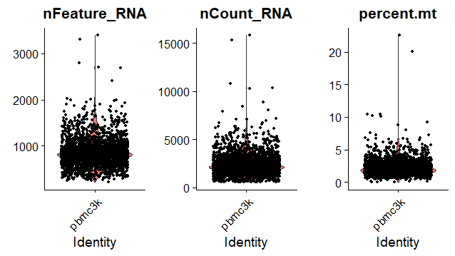
    从图中得到过滤信息:观察数据的分布范围,异常数据要过滤掉

    单个细胞基因数目nFeature_RNA:200-2500

    线粒体占比percent.mt:小于5%

    1
    > VlnPlot(pbmc, features = c("nFeature_RNA", "nCount_RNA", "percent.mt"), ncol = 3)

    RplotVlinPlot_percentage_MT

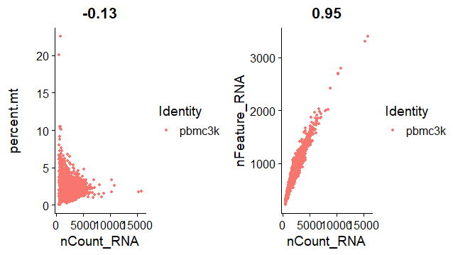
    用散点图(FeatureScatter)来绘制两组feature信息的相关性,组合在一起(CombinePlots)显示

    左图:reads count值和在线粒体的reads数量一般成反比,线粒体reads占比很高的情况一般有表达量的reads数很少

    右图:基因(feature)数量一般会和reads count值成正比

    1
    2
    3
    > plot1 <- FeatureScatter(pbmc, feature1 = "nCount_RNA", feature2 = "percent.mt")
    > plot2 <- FeatureScatter(pbmc, feature1 = "nCount_RNA", feature2 = "nFeature_RNA")
    > CombinePlots(plots = list(plot1, plot2))

    Rplot_combinePlots_scatter

    过滤细胞:

    保留gene数大于200小于2500的细胞,目的是去掉空GEMs和1个GEMs包含2个以上细胞的数

    保留线粒体基因的转录本数低于5%的细胞,目的是过滤掉死细胞等低质量的细胞数据。

    1
    > pbmc <- subset(pbmc, subset = nFeature_RNA > 200 & nFeature_RNA < 2500 & percent.mt < 5)

    表达量数据标准化

    LogNormalize的算法:A = log( 1 + ( UMIA ÷ UMITotal ) × 10000 )

    1
    pbmc <- NormalizeData(pbmc, normalization.method = "LogNormalize", scale.factor = 10000)
  4. 差异表达分析

    数据标准化:归一化

    LogNormalize的算法:

    A = log( 1 + ( UMIA ÷ UMITotal ) × 10000 )

    得到的结果存储在:pbmc[["RNA"]]@data

    1
    2
    3
    > pbmc <- NormalizeData(pbmc, normalization.method = "LogNormalize", scale.factor = 10000)
    # 默认参数,所以省略也可以
    # pbmc <- NormalizeData(pbmc)

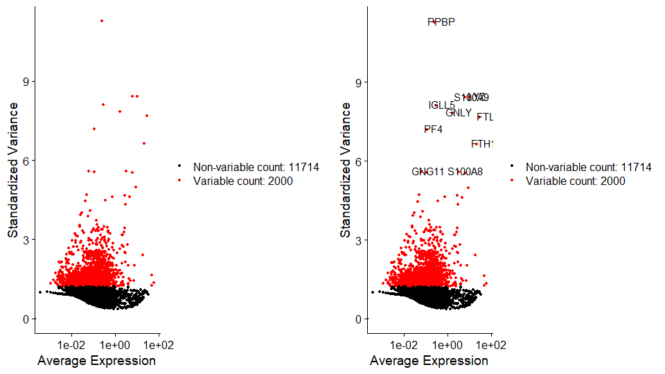
    鉴定表达高变基因HVGs (highly variable features),

    在细胞与细胞间进行比较,选择表达量差别最大的(也即是同一个基因在有的细胞中表达量很高,同时在部分细胞中表达很少)

    利用FindVariableFeatures函数,会计算一个mean-variance结果,也就是给出表达量均值和方差的关系并且得到top variable features

    2000个,用于下游分析,如PCA

    1
    > pbmc <- FindVariableFeatures(pbmc, selection.method = "vst", nfeatures = 2000)

    提取表达量变变化最高的10个基因

    1
    2
    3
    > top10 <- head(VariableFeatures(pbmc), 10)
    > top10
    [1] "PPBP" "LYZ" "S100A9" "IGLL5" "GNLY" "FTL" "PF4" "FTH1" "GNG11" "S100A8"

    画图

    左图:把pbmc全部基因画出来,红色是2000个HVGs

    右图:在左图基础上标出表达量变变化最高的10个基因

    1
    2
    3
    plot1 <- VariableFeaturePlot(pbmc)
    plot2 <- LabelPoints(plot = plot1, points = top10, repel = TRUE)
    CombinePlots(plots = list(plot1, plot2))

    Rplot_VariableFeaturePlot_Top10HVGs

  5. 降维

    数据标准化:零中心化

    目的是对数据进行线性转换(scaling),是降维处理(如PCA)之前的标准预处理步骤。

    使用ScaleData()函数:

    center: 将每个基因在所有细胞的表达量都减去均值,使得每个基因在所有细胞的表达量均值为0

    scale: 将center后每个基因的表达量除以标准差,让每个基因在所有细胞中的表达量方差为1

    1
    2
    3
    4
    5
    ## ScaleData()默认只是标准化高变基因(2000个),速度更快,不影响PCA和分群,但影响热图的绘制。
    # pbmc <- ScaleData(pbmc,vars.to.regress ="percent.mt")
    ## 而对所有基因进行标准化的方法如下:
    > all.genes <- rownames(pbmc)
    > pbmc <- ScaleData(pbmc, features = all.genes)

    移除不想要的差异来源

    如果要移除不想要的差异来源,可以用vars.to.regress

    这个例子里移除了线粒体

    更进一步的误差排除可以用另一个专业版函数:SCTransform,它也包含vars.to.regress这个选项。

    1
    > pbmc <- ScaleData(pbmc, vars.to.regress = "percent.mt")

    线性降维:PCA

    RunPCA:

    默认input用高变基因集,但也可通过features参数自己指定

    默认主成分数量是选50个

    结果保存在reductions 这个接口中

    1
    > pbmc <- RunPCA(pbmc, features = VariableFeatures(object = pbmc))

    检查PCA分群结果

    打印前5个PC,每个PC显示5个基因

    1
    2
    3
    4
    5
    6
    7
    8
    9
    10
    11
    12
    13
    14
    15
    16
    17
    18
    ## RunPCA结果保存在reductions这个接口中
    # print(pbmc@reductions$pca, dims = 1:3, nfeatures = 5)
    > print(pbmc[["pca"]], dims = 1:5, nfeatures = 5)
    PC_ 1
    Positive: FTL, FTH1, CST3, AIF1, S100A4
    Negative: MALAT1, IL32, LTB, IL7R, CCL5
    PC_ 2
    Positive: S100A8, S100A9, LYZ, CD14, LGALS2
    Negative: B2M, NKG7, GZMA, CTSW, PRF1
    PC_ 3
    Positive: CD74, HLA-DRA, HLA-DPB1, HLA-DQA1, HLA-DQB1
    Negative: PPBP, GNG11, SPARC, PF4, AP001189.4
    PC_ 4
    Positive: CD74, HLA-DQA1, HLA-DQB1, HLA-DQA2, HLA-DRA
    Negative: FCGR3A, FTL, RP11-290F20.3, S100A4, NKG7
    PC_ 5
    Positive: FCGR3A, RP11-290F20.3, MS4A7, MALAT1, CKB
    Negative: NKG7, LYZ, S100A9, S100A8, GNLY

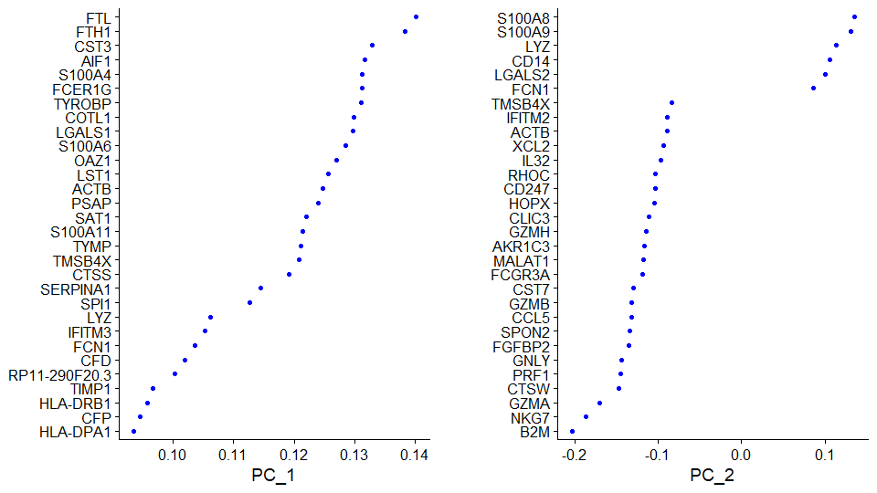
    展示主成分基因分值

    展示前两个PC里主成分基因的值

    1
    > VizDimLoadings(pbmc, dims = 1:2, reduction = "pca")

    VizDimLoading

    可视化降维后的结果

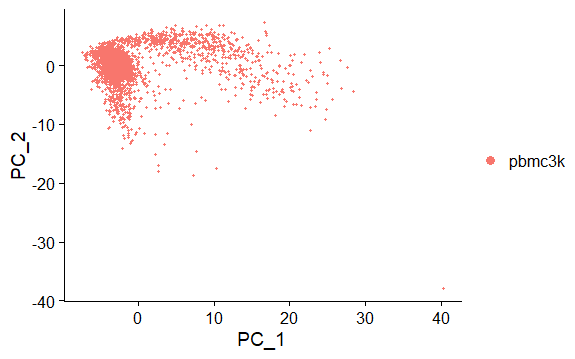
    DimPlot:

    默认提取前两个主成分,可以通过dim选项修改,绘制散点图

    图中的每个点代表一个样本。

    reduction指定降维方式类型,如果不指定,默认先搜索顺序umap->tsne->pca

    目前用的是PCA的结果

    降维后的数据在 cell.embeddings中,可以打印出来

    1
    2
    3
    4
    5
    > DimPlot(pbmc, reduction = "pca")
    > head(pbmc[['pca']]@cell.embeddings)[1:2,1:2]
    PC_1 PC_2
    AAACATACAACCAC -4.2153796 -0.8006517
    AAACATTGAGCTAC 0.9503998 -3.0434884

    DimPlot

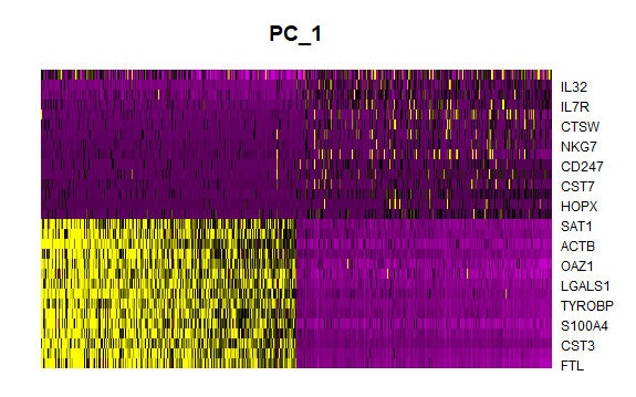
    画第一个主成分的热图

    默认画前30个基因,可以通过nFeatures设置

    dim:选哪几个主成分

    cells:细胞数

    balanced:TRUE表示正负得分的基因各占一半

    1
    > DimHeatmap(pbmc, dims = 1, cells = 500, balanced = TRUE)

    DimHeatMap1

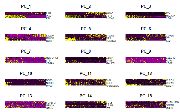
    画第1到15个主成分的热图

    DimHeatMap15

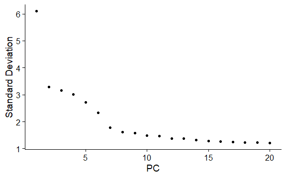
    查看主成分贡献度

    ElbowPlot画肘部图

    主要关注”肘部“的PC,它是一个转折点,选用转折点之前的PC就可以比较好地代表总体变化。

    从下图可以看出可以选择前10个PC

    在选择此参数时,建议选择偏高的数字(为了获取更多的稀有分群,“宁滥勿缺”);有些亚群很罕见,如果没有先验知识,很难将这种大小的数据集与背景噪声区分开来。

    ElbowPlot

    非线性降维:UMAP/tSNE

    性降维PCA(1933)一个特点就是:它将高维中不相似的数据点放在较低维度时,会尽可能多地保留原始数据的差异,因此导致这些不相似的数据相距甚远,大多的数据重叠放置
    tSNE(2008)兼顾了高维降维+低维展示,降维后的那些不相似的数据点依然可以放得靠近一些,保证了点既在局部分散,又在全局聚集
    UMAP(2018)相比tSNE又能展示更多的维度:参考文献

    Seurat里要用tSNE要先计算PCA。Seurat下游的分群只需要PCA降维结果就可以,但是用tSNE的话,二维显示的图比较好看。

    Tsne降维并可视化

    1
    2
    3
    4
    5
    6
    > pbmc <- RunTSNE(pbmc, dims = 1:10)
    > head(pbmc[['tsne']]@cell.embeddings)[1:2,1:2]
    tSNE_1 tSNE_2
    AAACATACAACCAC -10.99287 13.52608
    AAACATTGAGCTAC -28.57216 -27.23769
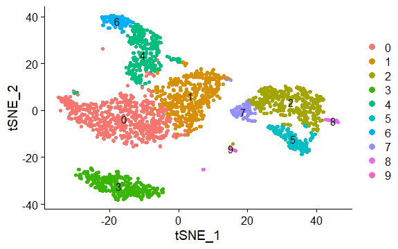
    DimPlot(pbmc,reduction = "tsne",label = TRUE,pt.size = 1.5)
    ![Rplot_tsne](/pic/Rplot_tsne.png)
    

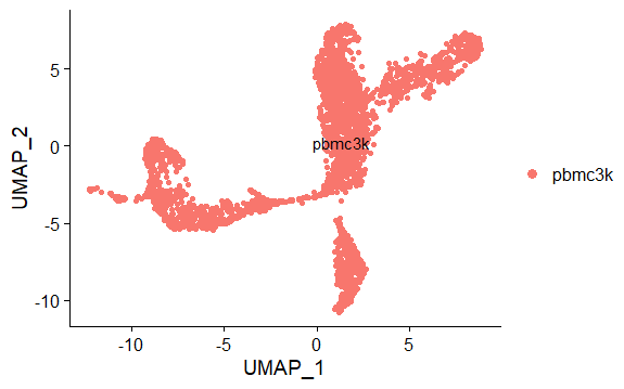
    Umap降维并可视化

    1
    2
    3
    4
    5
    6
    > pbmc <- RunUMAP(pbmc, dims = 1:10)
    > head(pbmc[['umap']]@cell.embeddings)[1:2,1:2]
    UMAP_1 UMAP_2
    AAACATACAACCAC 3.784667 3.790803
    AAACATTGAGCTAC 1.231294 -10.622349
    > DimPlot(pbmc,reduction = "umap",label = TRUE,pt.size = 1.5)

    Rplot_umap

  6. 基于图的集群

    计算权重

    FindNeighbors是基于图的

    input是之前降维确定的主成分(这里选用了前10个)

    根据PCA的结果,构建KNN图,得出近邻构成的小社区

    在小社区内,计算细胞两两之间的联系数(shared overlap)得到每条边的权重(Jaccard similarity)

    1
    > pbmc <- FindNeighbors(pbmc, dims = 1:10)

    聚类

    FindClusters默认使用Louvain算法

    resolution参数决定下游聚类分析得到的分群数,对于3K左右的细胞,设为0.4-1.2 能得到较好的结果(官方说明);如果数据量增大,该参数也应该适当增大。

    resolution可以理解为分辨率,如果分辨率越高,看得越清晰,分群数目就越多。

    1
    > pbmc <- FindClusters(pbmc, resolution = 0.5)

    查看结果

    Idents可以看出不同细胞的分群

    例子打印了前五个细胞结果

    1
    2
    3
    AAACATACAACCAC AAACATTGAGCTAC AAACATTGATCAGC AAACCGTGCTTCCG AAACCGTGTATGCG 
    4 3 0 2 4
    Levels: 0 1 2 3 4 5 6 7 8 9

    可视化

    本例基于tsne降维结果,不同颜色表示不同的群

    1
    > DimPlot(pbmc,reduction = "tsne",label = TRUE,pt.size = 1.5)

    Rplot_cluster_tsne

  7. 识别差异表达基因(cluster biomarker)

    识别cluster1中的marker基因

    `FindAllMarkers() 在细胞群之间比较,找到每个细胞群的正、负表达biomarker

    正负可以理解为上调、下调的意思;正marker表示在这个cluster中表达量高,而在其他的cluster中低;负marker表示在这个cluster中表达量低,而在其他的cluster中高

    ident.1:第一个群

    ident.2:第二个群,如果不填就认为是除了第一个群之外的所有其他群的集合

    min.pct:基因在任何两群细胞中的占比最低不能低于多少

    其他可选参数,还有结果每列的含义等详见文档

    1
    2
    3
    4
    5
    6
    7
    8
    > cluster1.markers <- FindMarkers(pbmc, ident.1 = 1, min.pct = 0.25)
    > head(cluster1.markers, n = 5)
    p_val avg_logFC pct.1 pct.2 p_val_adj
    CYBA 3.392038e-97 -50.92599 0.613 0.900 4.651841e-93
    CD74 2.543403e-91 -203.51709 0.641 0.890 3.488023e-87
    ACTB 1.818148e-84 -186.51617 0.982 0.995 2.493408e-80
    OAZ1 2.698853e-79 -47.51709 0.777 0.943 3.701207e-75
    FTH1 5.527059e-79 -370.51704 0.980 0.992 7.579808e-75

    识别每个cluster的maker基因,每个cluster取前两个maker保存到本地

    1
    2
    3
    4
    5
    6
    7
    ##寻找每一cluster的marker
    > pbmc.markers <- FindAllMarkers(pbmc, only.pos = TRUE, min.pct = 0.25, logfc.threshold = 0.25)
    ##每组取前两个marker
    > pbmc.markers.top <- pbmc.markers %>% group_by(cluster) %>% top_n(n = 2, wt = avg_logFC)
    ##存储marker
    > write.table(pbmc.markers,file="./output/allmarker.txt")
    > write.table(pbmc.markers.top,file="./output/topmarker.txt")

    比较cluster5和cluster0、cluster3的marker基因

    ident.2 = c(0,3)说明把cluster0、cluster3合并作为一个群

    1
    2
    3
    4
    5
    6
    7
    8
    > cluster5.markers <- FindMarkers(pbmc, ident.1 = 5, ident.2 = c(0, 3), min.pct = 0.25)
    > head(cluster5.markers, n = 5)
    p_val avg_logFC pct.1 pct.2 p_val_adj
    CFD 1.444184e-208 12.930168 0.956 0.032 1.980554e-204
    FCGR3A 1.905989e-199 20.996601 0.975 0.049 2.613873e-195
    RP11-290F20.3 3.500106e-199 4.916265 0.875 0.018 4.800046e-195
    IFITM3 1.752032e-198 49.819631 0.981 0.052 2.402737e-194
    CD68 1.486609e-196 5.804065 0.950 0.042 2.038735e-192
  8. 可视化

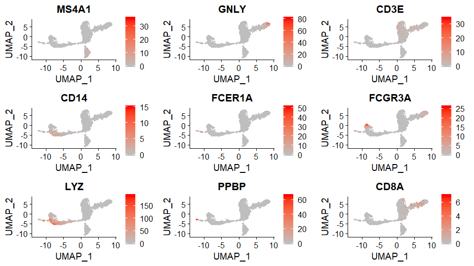
    FeaturePlot

    最常用的可视化

    将基因表达量投射到降维聚类结果中

    1
    > FeaturePlot(pbmc, features = c("MS4A1", "GNLY", "CD3E", "CD14", "FCER1A", "FCGR3A", "LYZ", "PPBP", "CD8A"),cols = c("gray", "red"))

    FeaturePlot

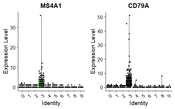
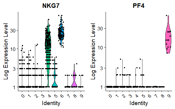
    小提琴图VlnPlot

    展示某些基因在所有细胞群的表达量

    1
    2
    > VlnPlot(pbmc, features = c("MS4A1", "CD79A"))
    > VlnPlot(pbmc, features = c("NKG7", "PF4"), slot = "counts", log = TRUE)

    Rplot_vln

    Rplot_vln2

    热图DoHeatmap

    1
    2
    3
    ## 每个细胞群选前十个基因,所以一共有100个基因
    > top10 <- pbmc.markers %>% group_by(cluster) %>% top_n(n = 10, wt = avg_logFC)
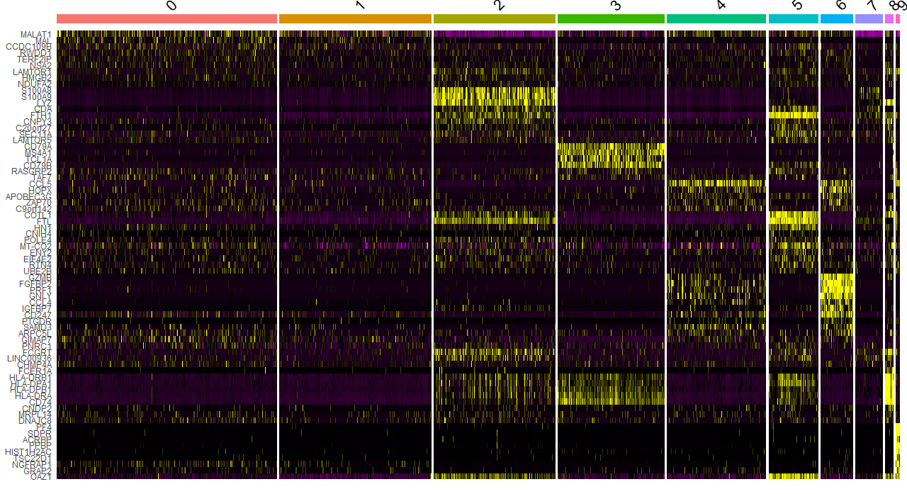
    > DoHeatmap(pbmc, features = top10$gene) + NoLegend()

    DoHeatMap

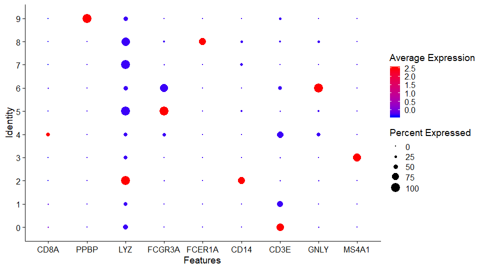
    气泡图DotPlot

    y轴是细胞群

    颜色表示平均表达量

    大小表示表达的基因个数占总个数的百分比

    DotPlot

    山脊图RidgePlot

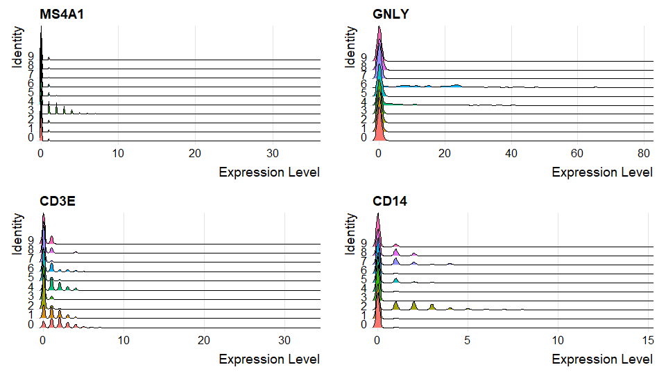
    x轴是表达量,y轴是细胞群

    feature1的(x,y)位置山脊高说明feature1基因在y细胞群,表达量为x的细胞很多

    1
    RidgePlot(pbmc, features = c("MS4A1", "GNLY", "CD3E", "CD14"), ncol = 2)

    Ridge_Plot

  9. 判断细胞类型

    根据每个群找出来的biomarker来判断每个细胞群的细胞类型。

    需要结合额外的背景知识,可以查阅文献和数据库CellMarker。

    官网给出的背景知识:

    | Cluster ID | Markers | Cell Type |
    | :————- | :—————— | :—————- |
    | 0 | IL7R, CCR7 | Naive CD4+ T |
    | 1 | IL7R, S100A4 | Memory CD4+ |
    | 2 | CD14, LYZ | CD14+ Mono |
    | 3 | MS4A1 | B |
    | 4 | CD8A | CD8+ T |
    | 5 | FCGR3A, MS4A7 | FCGR3A+ Mono |
    | 6 | GNLY, NKG7 | NK |
    | 7 | FCER1A, CST3 | DC |
    | 8 | PPBP | Platelet |

    给群添加细胞类型标签(Cell Type)

    1
    2
    3
    4
    > new.cluster.ids <- c("Naive CD4 T", "Memory CD4 T", "CD14+ Mono", "B", "CD8 T", "FCGR3A+ Mono", "NK", "DC", "Platelet")
    names(new.cluster.ids) <- levels(pbmc)
    > pbmc <- RenameIdents(pbmc, new.cluster.ids)
    > DimPlot(pbmc, reduction = "tsne", label = TRUE, pt.size = 1.5) + NoLegend()

    上面的代码是会报错的,因为我的分群结果是10个,但标签只有9个。

    官网的分群结果是9个,背景知识表格给的也是9个,所以例子里的标签也是9个。

    至于为什么一样的数据,一样的代码,一样的参数,结果确不一样呢?Who Knows.

    不是真的研究数据所以不想做背景Research了,代码意会一下。

    下一个教程会用一个自动注释的R包SingleR来添加标签。

  10. 保存数据

    存储细胞归类结果

    1
    > saveRDS(pbmc, file = "./output/pbmc3k_final.rds")

Ref:

[1] 单细胞Seurat包升级之2,700 PBMCs分析(上)

[2] 单细胞Seurat包升级之2,700 PBMCs分析(下)

[3] Seurat - Guided Clustering Tutorial

[4] 一文读懂单细胞测序分析流程

车牌识别-TensorFlow (1-克隆运行)

发表于 2017-10-30 | 分类于 车牌识别

克隆代码

从github仓库克隆代码到本地

更改:适应更新的python(print)和tensorflow(label……)版本,以及window环境(fname.split(“\\”)[1])

运行调试

说明:已经配置好环境,版本Python3.5,TensorFlow1.x,OpenCV3

1.导入背景图片

下载[SUN397.tar.gz]

1
python extratbgs.py SUN397.tar.gz

2.合成训练图片

1
2


3.训练

1
2


4.识别

车牌识别-TensorFlow (0-环境配置)

发表于 2017-10-28 | 分类于 车牌识别

环境要求

Python, TensorFlow, OpenCV, NumPy

安装过程

说明:基于Anaconda来搭建开发环境, Windows系统

前提:已经安装好 Anaconda,打开cmdconda --version可以正确显示版本号

安装Python3.5

1
2
3
4
5
6
7
8
9
10
11
12
13
14
15
16
17
conda create --name python35 python=3.5
# conda info --envs
activate python35
# python --version
# deactivate python34
# conda remove --name python35

# conda list
# conda list -n python35
# conda search numpy
# conda install -n python35 numpy
# conda update -n python35 numpy
# conda remove -n python35 numpy
# conda update conda
conda install anaconda
# conda update anaconda
# conda update python

安装Tensorflow

参见官网Installing with Anaconda

CPU版本

1
pip install --ignore-installed --upgrade tensorflow

安装OpenCV

1
conda install --channel https://conda.anaconda.org/menpo opencv3

HELLO WORLD

发表于 2017-10-28 | 分类于 Other

HELLO WORLD! —-WJ

Jie Wang

太阳强烈 水波温柔

10 日志
5 分类
2 标签
GitHub E-Mail
© 2021 WJie12
由 Hexo 强力驱动
|
主题 — NexT.Mist v5.1.3